How to (legally) steal the look and feel of Twitter
21Dec'11

Sometimes you don’t have the resources to invest on the design of your new site. “We’re on the prototyping stage”. “I don’t have money to pay a designer”. If you’re a programmer (like me) and know the very basics of HTML and CSS, you still can easily add some cool effects to your site. This post is just a tip on how can you get some of the effects you see on Twitter.
But please, don’t do this to every site you work on. I like to see different designs on different sites. If all sites start to copy each other’s design, the web will became boring. Invest on the design of your site as soon as possible ツ
The Bootstrap Project
No, you don’t need to hack Twitter to copy the CSS declarations. Twitter itself keeps an open source project called Bootstrap, with some of the layouts used in the Twitter site: buttons, tabs, grids and most effects you see there. It is very simple to use in a simple website. Just put the following code on the HEAD section of your HTML, and half of the work is done:
<link rel="stylesheet" href="http://twitter.github.com/bootstrap/1.4.0/bootstrap.min.css">The Grid System
Something that was new for me until a few weeks ago is that there are some very common dimensions used in very different sites. The usually called the “grid system” is just a convention to use a big column 960 pixel wide, divided in 16 columns of 40 pixels, with 20 pixels of space between them. You combine how many columns you want to distribute your page content and it probably will have a good look. Bootstrap has one implementation of the grid system. If you want to use only the grid system I recommend you to use the 960 Grid, as it is smaller than the whole Bootstrap.
Pretty Input
Another cool thing on Bootstrap is the gloom effect on input fields. Let’s see it:

And how you add this effect? You already did when declaring the use of Bootstrap. But you can customize it by just adding a class to the input field:
Missing code here during a blog migration
There is also a fork of the project on GitHub, adding a few more options to personalize the input fields. You may want to give a look.
Improving Usability
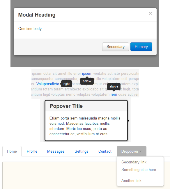
Bootstrap also gives some JavaScript codes that can help you add some common behaviors in web pages these days. It is based on JQuery plugins, so if you already know JQuery, you will have no trouble with it.

Well, this is just a cool project that I’ve found, and I thought it was veeeery interesting. I believe you too. I could develop some demo, but the Bootstrap page itself is very complete and self-explanatory, so I just took some images to illustrate what Bootstrap is capable of. But if you know other projects such as this one, please leave a comment.
UPDATE: recently, I discovered a similar project called Fbootstrapp, which can be used to develop Facebook apps with the Facebook look-and-feel.
Tags: CSSJavaScript
 LinkedIn
 Facebook
 Twitter
 Feeds
Feeds